Pages

Sunday, June 26, 2016

Zen Flower Burst


A few weeks ago I taught a Distress Techniques class. One of the most requested techniques I get is how to blend with Distress Ink. I also have a lot of people ask me what is Distress Ink. 

Distress Inks are acid free, non-toxic, fade resistant, water based dye inks. When Tim Holtz first developed this line of inks, he did so to help crafters actually make their projects look “distressed”, or worn and yellowed. Over time, as more and more colors have been added to the collection, the range of Distress Inks has grown to encompass, not only his beloved browns and neutrals, but a wide array of bright, vibrant colors. Distress inks stay wet much longer than other dye based inks, and are specially formulated to react with water. They are therefore ideal for many interesting and beautiful background techniques.


This is one of the cards from my Distress Techniques class. This card illustrates color blending, and shows how beautifully Distress inks can be blended together when using patience and going slowly.

For this card, I masked above and below the inked area with Post-It 2 inch wide tape. I left slightly over 1" of my panel open for inking. The panel is 80# Neenah solar white Classic Crest cardstock, cut to 3.75" x 5". It is very important to get your masks straight for this to look good, so use a guide behind your panel, such as graph paper. After taping off the panel, I applied the inks with a Tim Holtz mini blending tool. I began with Twisted Citron, and began to apply ink in a circular motion, using hardly any pressure. In order to apply ink without making unwanted blotchy spots or dark marks on your paper, you have to start out very slowly and softly. 

Once you have gotten some ink down, you can slowly build it up by adding a little more pressure, and continue to add pressure as you go along. With very dark or juicy inks, it may be beneficial to tap off the blending tool before you apply it to your panel. This process takes patience and some practice to get it just right. I continued inking the panel with Peacock Feathers, and then Wilted Violet, covering about 1/3 of the unmasked area with each color. 

When the inking is complete and you are happy with the colors, the masking should be peeled off. At this point, the blending always looks amazing. I promise you'll think so if you give this a try.

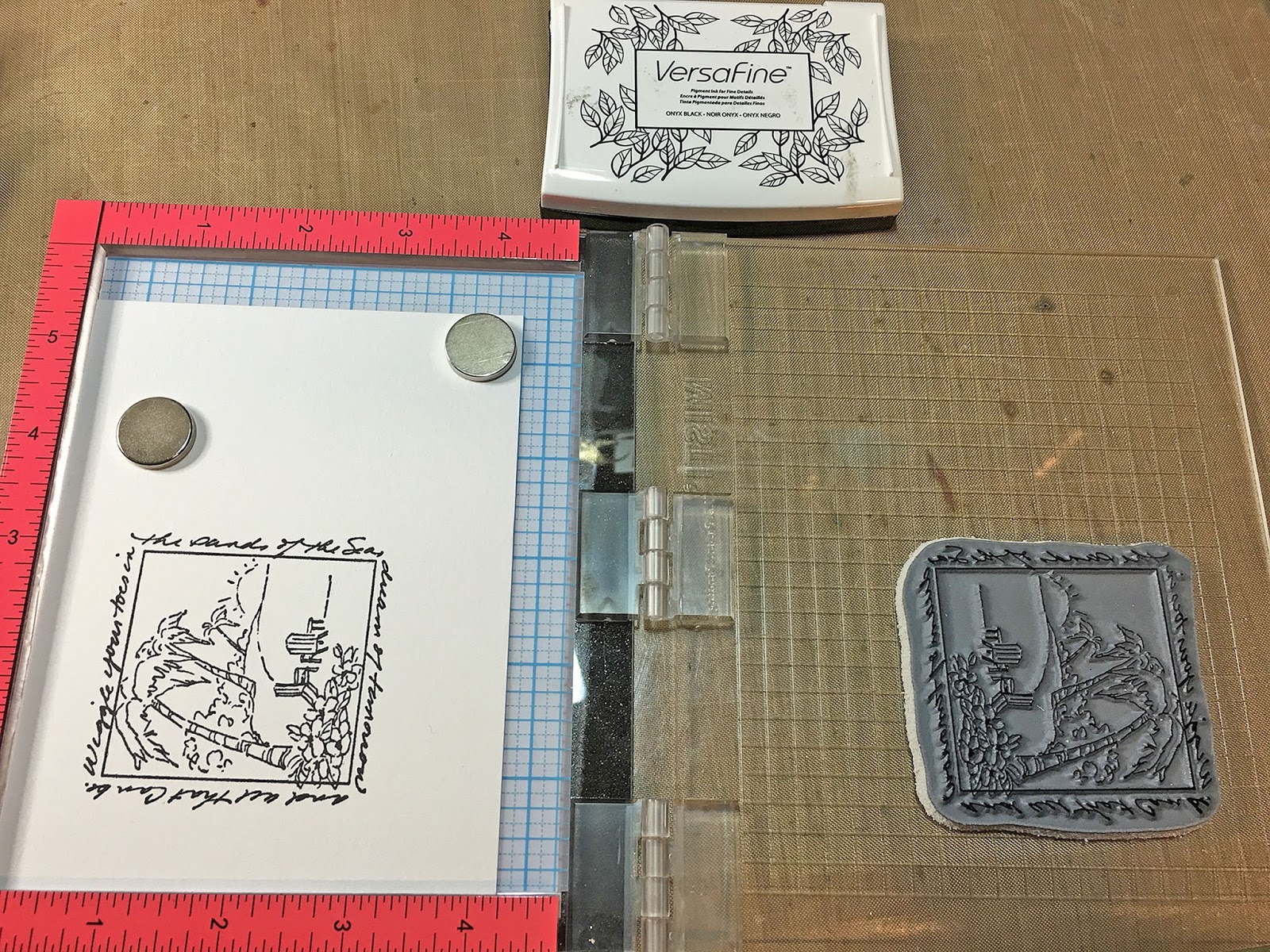
To finish the card, I stamped it with the Zen Flower Burst stamp that I designed for Magenta, which is one of my favorite stamps. Since I stamped it using the MISTI stamping tool, I was able to use Wilted Violet Distress ink and stamp it several times to get it as dark as I wanted it. I finished the card with a sentiment from Magenta, matted the panel and mounted it on a card base, and then scattered a few sequins.

Magenta Products Used:
(If you are local, please look for products at Art 'n Soul. If you are not local and wish to find Magenta products, you can click on the link in the stamp name below each image, or you can visit the Magenta online store here).

Zen Flower Burst 44.017.L
Art Washes 07.691.G

Other Products Used:
Distress Inks: Twisted Citron, Peacock Feathers, Wilted Violet

Post-it® Labeling Tape 695

Tim Holtz mini blending tool
Versafine Onyx Black ink
So Silk Fair Blue cardstock for matting
80# Neenah solar white Classic Crest cardstock for panel
110# Neenah solar white Classic Crest cardstock for base card
Various sequins


Tuesday, June 21, 2016

Zen Butterfly Passion

I have this post on the Magenta blog today. This card illustrates one of my favorite techniques using Distress ink: acrylic block stamping.


I applied three colors of Distress ink to an acrylic block (Wilted Violet, Picked Raspberry, and Spiced Marmalade). This particular block from Tim Holtz has a grid etched into it that shows up in the stamping, and gives texture to the piece.

Once the color was applied to the block, I held it at arm's length and sprayed it with water mixed with Perfect Pearls powder, until the color on the block beaded up. The Perfect Pearls gives a nice shimmer to the end product.

After spraying the block, I stamped it onto watercolor cardstock and pressed down hard, until I could observe that a good deal of the color had transferred to the panel.

After drying the panel thoroughly, I stamped the Zen Butterfly stamp with Versamark ink, and embossed it with White Diamond embossing powder. The sentiment was also stamped and embossed with White Diamond.

You can see a step by step photo tutorial on acrylic block stamping on my blog here. You can see other posts on acrylic block stamping here, here, and here.

Magenta Products Used:
(If you are local, please look for products at Art 'n Soul. If you are not local and wish to find Magenta products, you can click on the link in the stamp name below each stamp).
Zen Butterfly 44.019.K
Give wings to your passion 07.835.G
Other Products Used:
Tim Holtz Acrylic Blocks
Tim Holtz watercolor cardstock
So Silk Beauty Pink cardstock
Distress Ink: Wilted Violet, Picked Raspberry, Spiced Marmalade
Perfect Pearls Powder
Lawn Fawn die LF768, Small Stitched Rectangle Stackables
Versamark ink
Judikins White Diamond embossing powder
Various sequins

Friday, June 17, 2016

Technique of the Week: Windows to the World and Tombow Watercolors


This is such a fun and simple technique, and one you may have seen before, but I wanted to show it once more.


One really fun way to color your stamping is to stamp on watercolor paper; then partially color with Tombow markers and apply a wet brush to your coloring to draw out and blend the color.

A super fun series of stamps to use for this technique are the Art Impressions Windows to the World stamps. They are quick and easy, and really all you need to make a beautiful card.


I chose a summer favorite called Island Window. It's an idyllic scene with palm trees, and I chose to color mine like sunset.


I stamped the image onto Tim Holtz watercolor paper with Versafine Onyx Black ink, and embossed it with JudiKins Clear Detail embossing powder. I chose the Tim Holtz paper because it is white, and I wanted the uncolored edges of the paper to match my base card.


To choose colors, I tried them out on the edge of the paper, since I was using a bigger piece that I would need for my card. When I got colors I liked, I started coloring where I wanted the colors to be darkest. Working in fairly small areas at a time, I colored with a marker, and then wet a brush and pulled the color out into a larger area. I started out using a water brush, but honestly, I found I had more control just using a regular brush and some water.


If you need more color in an area that has already been colored, you can color on your craft mat with the marker and pick the color up with your brush. It's not really a good idea to touch your marker to a wet area.

 I just worked around the image this way until I was happy with how it looked.


To finish my card, I die cut the image using Die-Namics MFT-600 In & Out Stitched Rounded Square die. I took a piece of Fair Blue So Silk cardstock cut to 5.25 x 4, and embossed it with a WRMK Next Level embossing folder, "Wave". I mounted the image onto the embossed panel, adhered it to a white base card, and added a few sequins.


I really hope you give this technique a try; it's quick and such an enjoyable way to color your images. 


Materials Used:
Art Impressions Stamp UMM-3178 Island Window
Tim Holtz Watercolor paper
Versafine Onyx Black Ink
JudiKins Detail Clear embossing powder
Fair Blue So Silk Cardstock
WRMK Next Level "Waves" embossing folder
Tombow Markers:
N60, 452, 526, 098, 245, 133, 076, 055, 025, 985, 946, 755, 899
Various sequins
Die-Namics MFT-600 In & Out Stitched Rounded Square die


Friday, June 3, 2016

Technique of the Week: Make a Splash!


In conjunction with the Art 'n Soul weekly newsletter, here is the new Technique of the Week.

Splash Ink is a product that I have been meaning to get back to. They are so fun to play with, and give such beautiful results.


Splash Inks are made of pigments suspended in a fine acrylic emulsion. They are compatible with all waterbased mediums and paints and can be used for watercolor techniques on most porous surfaces. We carry sets of these at Art 'n Soul, and they come in 4 basic colors: magenta, yellow, blue & black. Hundreds of different hues can be mixed using these 4 colors. The recipe card that comes with the set has instructions for mixing 100 colors.

Lisa Lee of Inchie Arts came and did a class for us, where we sprayed Art Squares with water, and then just dropped color directly from the Splash Ink bottles onto the wet Art Squares. After setting them aside and leaving them to dry, we had amazing little works of art that, when attached to a base card with a sentiment stamped, made gorgeous and quick cards for any occasion.

I wanted to try this same method, but first stamp and emboss an image on the Art Squares

Here are the cards I made

Magenta stamps: I.0406 Fresh Bouquet in Square;
07.670.H I love the way our lives are interwoven

Magenta stamps: G.0432 Fish; 07.734.F See the World


Magenta Stamps: 09.163.H Flower; 07.954.G Think about you often


Magenta stamps: 23.249.J Framed Daisies;
07.525.F You are the Sunshine

I chose 4 Magenta stamps, which are older images that I found in my stash. I wanted stamps that had a good amount of open area in them, and would also fit onto a 2" Art Square.

I chose white 2" Art Squares (Twinchies), stamped each one with a Magenta image in Versamark ink, and embossed each with JudiKins Opaque White embossing powder.

I.0406 Fresh Bouquet in Square
G.0432 Fish
09.163.H Flower
23.249.J Framed Daisies

One by one, I sprayed each square with pearly water (1/4 tsp Perfect Pearls powder in 2 oz water). I then dropped drops of Splash Ink onto the wet image, and left it to dry overnight. When I first dropped the ink, it completely obscured the image, and I wondered if my experiment was going to work. 


After absorbing into the Art Square, the embossed image did resist most of the ink. 


I used a damp baby wipe to wipe a little of the color off the embossing, but not all. I like the way the colors have a watercolor look; unpredictable but beautiful.


To finish each card, I got a strip of cardstock that would coordinate with the Splash colors used. Each strip was embossed with a different embossing folder, and adhered to the base card. The finished Art Squares were mounted to each card with a piece of slightly smaller white fun foam underneath, thereby popping up the square. I then chose Magenta sentiments to stamp beneath the panels on each card.

I hope you try this technique. It was very easy and a lot of fun. Art 'n Soul does carry sets of Splash Inks. The colors can be mixed and also used for painting. They are intense and beautiful.

Magenta Products Used:
Card #1
I.0406 Fresh Bouquet in Square

07.670.H I love the way our lives are interwoven

Card #2
0431.G Fish
07.734.F See the world

Card #3
07.954.G Flower

07.954.G Think about you often

Card #4
23.249.J Framed Daisies

07.525.F You are the sunshine

Other Materials Used

Card #1
Splash Inks: Yellow, Magenta
White Twinchie (2") Artboard Square
Versamark Ink
JudiKins White Opaque embossing powder
Stardream Chiara Amber paper
Versafine Onyx Black ink
We Are Memory Keepers Next Level embossing folder - Woven

Card #2
Splash Inks: Yellow, Blue, Magenta
White Twinchie (2") Artboard Square
Versamark Ink
JudiKins White Opaque embossing powder
So Silk Fair Blue paper
Memento Danube Blue ink
We Are Memory Keepers Next Level embossing folder - Wave 662676

Card #3
Splash Inks: Yellow, Blue, Magenta
White Twinchie (2") Artboard Square
Versamark Ink
JudiKins White Opaque embossing powder
Star dream Fairway paper
Memento Danube Blue ink
We Are Memory Keepers Next Level embossing folder - Geometric 662688

Card #4
Splash Inks: Yellow, Blue
White Twinchie (2") Artboard Square
Versamark Ink
JudiKins White Opaque embossing powder
So Silk Shocking Green paper
Memento Danube Blue ink
We Are Memory Keepers Next Level embossing folder - Wave 662676