Pages

Wednesday, April 28, 2021

Spring Blooms Corner for Multiple Cards

I needed to make a sympathy card recently and I pulled out the Simon Says Stamp Spring Blooms Corner that I had not yet used. I really like these silhouette type of dies, and I'm planning to use it for more cards in the future.


I first cut a panel of 80# white Nina cardstock with The Greetery Crimped Frame die to get the size just right. I then cut the panel with the Spring Blooms Corner. I placed the cut panel over a background that I had previously made using alcohol inks and glossy white cardstock. I had not found anything to use the panel with until this card. It had just the right tones to create a colorful floral mix.

These are some of the things I used. The background showing below was one of the shaving cream backgrounds I made awhile back (you can see a post where I show how to make shaving cream backgrounds here).


I stamped the white panel with a Magenta Sympathy stamp, and mounted both pieces onto a white base card. I made two more, since Sympathy is the hardest kind of card for me to make.


I also had a birthday card to make, and this die can easily make a card for almost any occasion. The card this time is for a friend for whom I always make a black and white card. I actually think it looks classy in black and white.


At the end I added a few black acrylic dots from my stash.

Magenta Products Used:

07.928.I With Sympathy

Other Products Used:
Simon Says Stamp sssd112325 Spring Blooms Corner
Poppy Stamps 2437 Happy Birthday Poe Script
The Greetery Crimped Frame die
Various backgrounds from my stash
Neenah Solar White 80# & 110# cardstock
PTI True Black Cardstock
Versafine Onyx Black ink

Friday, April 23, 2021

Super Saturday at Magenta: Christmas Card with Pan Pastels

Hi all, I'm over at the Magenta Blog today, and you can see that post here.

This is my Christmas Card for April. Yeah, I didn't make any in March, and I'm letting that go. I will still have plenty of cards by the end of summer, which is my goal. Honestly my craft space(s) renovation has been taking up a lot of my time and energy. You can see my Part 1 post here.


 I decided to pull out my Pan Pastels for this card. I have some metallics that I haven't used a whole lot.


This background stamp is new to me, and I can't believe I never saw it when it first came out. It's really a beautiful design by former Magenta designer Valerie. First I die cut a piece of red cardstock, using the Greetery Nordic Frames die. I think this die is great for a Christmas card.

I stamped the Wishing You Peace Love Joy sentiment toward the bottom third of the panel in Versamark ink and embossed it using gold embossing powder. I then masked off the sentiment area with 1" wide Post It tape. 


I stamped the background image on the panel using Versamark Ink and then removed the tape. Using a sponge applicator, I applied gold Pan Pastel over the entire cardstock. Excess pastel was removed with a Swiffer cloth.


This shot shows how shiny the metallic Pan Pastels are. I was contemplating using strips of the gold cardstock above and below the sentiment, but in the end decided not to.

I matted the panel with gold cardstock and then mounted it to a base card.

I love how this card turned out, but there is one issue that I wasn't super happy with. It's usually a good idea to seal pastel to your cardstock because it can rub off. I don't think it rubs off as much if you are using Versamark ink to hold it there, but it can happen, and I don't want that to be an issue since I'm mailing these cards away. I sprayed my panel with a fixative spray, and I think it dulled the gold shine of the pastel a bit. In any case, I didn't think it was quite as amazingly shiny and bright after spraying. I'm planning to get a different brand of fixative (Spectrafix) that is recommended for pastels and try it out. I will let you know how I like it.

If you have been reading my blog you know that I have been working on renovating my craft space(s). My work space has been incorporated with my office (see Part 1 link at the beginning of this post). My former craft room will be used for storage. I haven't been able to obtain a Kallax unit from Ikea yet, but my craft supplies will be stored in containers that will go into Kallax shelving eventually. I have obtained some of those containers to get started.


This is one of the boxes I will use, and there will be black and white ones of these. My plan is to make a panel for the front of each that will reflect what is inside. Since I have my Pan Pastels out, I am going to make a panel for the front of this one. Stay tuned for a future post about it.

Magenta Products Used:

Other Products Used:
The Greetery Nordic Frames die
Versamark ink
Gold Pan Pastel
Ranger Gold Embossing powder
PTI Pure Poppy cardstock
Curious Metallics Super Gold cardstock
Neenah Solar White 110# cardstock


Friday, April 16, 2021

Magenta Card Exchange April - The Netherlands

This month I got to send a card to the Netherlands again. I have such fond memories of visiting that beautiful country, and would love to go back someday.


For this card I used a rectangular stencil and brushed Distress ink in Wild Honey from the lower left corner to the upper right, allowing the color to fade out at the upper right. I splattered the Distress ink with water to create some spots.


Once my panel had dried, I stamped the beautiful Clover Silhouette stamp in black. This stamp was designed by Elie Knoll, one of Magenta's talented Dutch Design Team members. Then also in black, I stamped the hello! sentiment, which is one of my favorites of the calligraphy stamps designed by the amazing Sally Penley for Magenta. Last, I stamped the  Zen Butterfly, which is a stamp I designed for Magenta. The butterfly was stamped with Versamark ink and embossed in gold.


I spattered some gold paint onto the panel, and I took an oblique photo of the card to show how shiny the gold is in real life. I die cut the panel using The Greetery Crimped Edge die, and matted it with gold cardstock, and then onto a base card.


This is the sneak peek shot I posted onto the Magenta Passion Studio. It shows how really gold and shiny the card is.


Magenta Products used:


07.976.G hello!

Other Products used:
Distress ink: Wild Honey
Versafine Onyx Black ink
Versamark ink
Sakura Gold Poster Color
Ranger gold embossing powder
The Greetery Crimped Frame die
Curious Metallics Super Gold cardstock
Neenah Solar White 80# & 110# cardstock

Thursday, April 15, 2021

Craft Room Makeover Part 1

I wanted to do this post to share with you why I have not been posting as much lately. Because of family circumstances during 2020, I started crafting in our dining room. It's a space that doesn't get used a lot because we have a dinette table next to the kitchen where we have our meals.

I was keeping my favorite Distress Inks in tins on the dining table, and other inks, that were tumbling all over the place. I was changing out what I had on the table constantly - going back and forth to my craft room, which is one of the spare bedrooms. The dining room was a constant mess; it's also where I was doing all my paper cutting and die cutting, and it is a room very visible to the front door. It didn't really matter a lot, because no one is visiting during the pandemic, and I was getting a lot done, even though the space was pretty messy. At the start of 2021, I finally decided that the mess was not working for me. A friend inspired me with her office/craft space, and I decided that I could use my fairly large chunk of shared office space as a craft work space.


This is an after picture of my office space, which is now an office/craft workspace, and I love it. This picture was taken before I added my big shot to the empty space under the shelf, to the right. Baby Yoda is guarding/hiding the router. My husband made this shelf for me, and it doubles my space here. I also added a LOT of photos of my children and grandchildren on the wall under the shelf. I really love this space, and it's so nice to work in. I can move my laptop way to the back of the desk area and work on the mat in front. I kind of cringe to show you any before pictures, but I will show you the craft room. 


This is what used to be my craft work space. I used to think that if I didn't have everything out where I could see it, I would forget I have it. This is not entirely untrue, but it also means that I have too much stuff. I worked at a beautiful art stamp store for 7 years, and you can imagine that I did accumulate a lot. One of the things that my friend made me realize is that I should decide what is really important to have close at hand.

The desk in the picture above will be removed, and there will be no rolling carts. I plan to cover the wall where the desk is with an Ikea Kallax (whenever they get them back in stock at our Ikea), and some stacked drawer units. What doesn't fit will have to go! The Distress ink holders and Copics in the above photo have already been moved into my office, and I have done a lot of other clearing out of this space, but it still looks like a tornado hit it right now.


This is the other side of the craft room and it will not change a lot. I will get rid of some things though, and update how it looks (like maybe change the Amazon cardboard box to something a bit more attractive). There is also a closet that I'm going to go through and clean things out of. I plan to be as ruthless as possible. The dining room will be completely clear of any craft things, and this room will act as a craft storage space.


This I will save. These are all of the stamps I designed for Magenta over the years. I have them in cling as well, and I still use them on my cards.

I will post photos of the craft storage room once it's finished. It will be a much nicer looking space. This project is almost all I can think about right now. I had to stop because I had some April obligations and goals to get done. It was so hard to break away from this. It will be really nice to have a cleaned up dining room when it's time to invite people over for dinner again!

Here's one last picture for now, to give you a laugh. Between the kit that I would take to classes, my office desk, and my craft desk, with a large circular tool holder, these are all of the scissors I have accumulated over the years. Geez I honestly had no idea.


This doesn't count my scissors that are only for fabric, which are tucked away. It's really hard for me to get rid of scissors, can you tell? It will happen though!

One last thing to tell you: I have a large number of people who subscribe to my blog. I have been notified that this gadget (run by feedburner) will no longer be supported as of July. I hope all of you will continue to check up on my blog and see what I'm working on.


Monday, April 12, 2021

April Cards for Charity: Thank You - Distress Blending

 The second batch of cards I have done for my friend's Church's charity are Thank You cards. Once again I made 5 cards each of 3 different color combinations.  I used the Simon Says Stamp stencil ssst121467 Peony Bouquet. Trust me, pretty much whatever you do with this stencil will be beautiful.


I blended Distress inks through the stencil for the flowers and leaves using both large brushes and the small iCrafter brushes. 


These are all of the colors I used on the cards


The backgrounds using this stencil always turn out so beautifully. I die cut each panel using the Greetery Crimped Frame die, and I chose a coordinating color of cardstock for the card mat.


I cut out the sentiment for each using the same color as the mat. The Thank You sentiment die is from Simon Says Stamp CZD74.


Each of these panels will be mounted onto base cards that are printed with the charity information by church volunteers.

Products used:
Distress inks: Wild Honey, Crackling Campfire
Speckled Egg, Mustard Seed, 
Wilted Violet, Peacock Feathers,
Twisted Citron, Peeled Paint
Simon Says Stamp Stencil ssst121467
Simon Says Stamp Thank You die CZ074
The Greetery Crimped Frame die set
PTI Terracotta Tile cardstock
So Silk Fairly Blue cardstock
So Silk Glamour Green cardstock


Thursday, April 8, 2021

April Cards for Charity: Happy Birthday Distress Blending

 Once again I have made some cards for my friend Pam's Church's charities. The request this time was for Some Birthday cards and some Thank You cards. I did the Birthday cards first. Since they prefer to get 15 of each design, I try to keep them fairly simple. It still took me a lot of time to make 15!


I elected to make 5 each of 3 different color schemes. Those buying the cards are told that since these are handmade cards, there will be some variances.


For each of these panels, I used the Simon Says Stamp Geo Leaves stencil ssst121473, and three colors of Distress inks. I used brushes to apply the inks through the stencil, trying to blend them as I went along.


I like this stencil for Birthday cards, because it looks celebratory to me; sort of like leaf confetti.


I like using the small Make Art metal platform when I use stencils. The magnets hold my project in place very well.


This blend is one of my favorite Distress blends of all time: Twisted Citron, Peacock Feathers, and Wilted Violet.


Making these backgrounds was fun, easy and relaxing. I think backgrounds like this could be used for a variety of purposes.


I chose a color of mat for each blended panel and die cut the sentiment out of the same cardstock. The purple and blue sentiments are from So Silk cardstock, so they are shiny on their own. The orange one is from PTI cardstock, and looks very matte. Since this is a Birthday card, I wanted it to have a bit of a sparkle, so I colored over the sentiment with a Wink of Stella clear glitter pen.

Products Used
Distress Inks: Speckled Egg, Mustard Seed,
Twisted Citron, Abandoned Coral,
Wild Honey, Peacock Feathers, 
Wilted Violet
ssst121473 Geo Leaves Stencil
sssd112116 Happy Birthday Brush Script die
The Greetery Crimped Frame die
So Silk Fair Blue Cardstock
PTI Terracotta Tile Cardstock
So Silk Passion Purple Cardstock
Wink of Stella clear glitter pen

Friday, April 2, 2021

Magenta Super Saturday: Coloring with Watercolor, Zig Markers and Colored Pencils

 I'm over at the Magenta blog today, and you can see that post here.


I had a lot of fun making cards with the Magenta Large Flower Tile stamp today. There is a story behind the creation of this stamp, and I will share that with you at the end of this post.


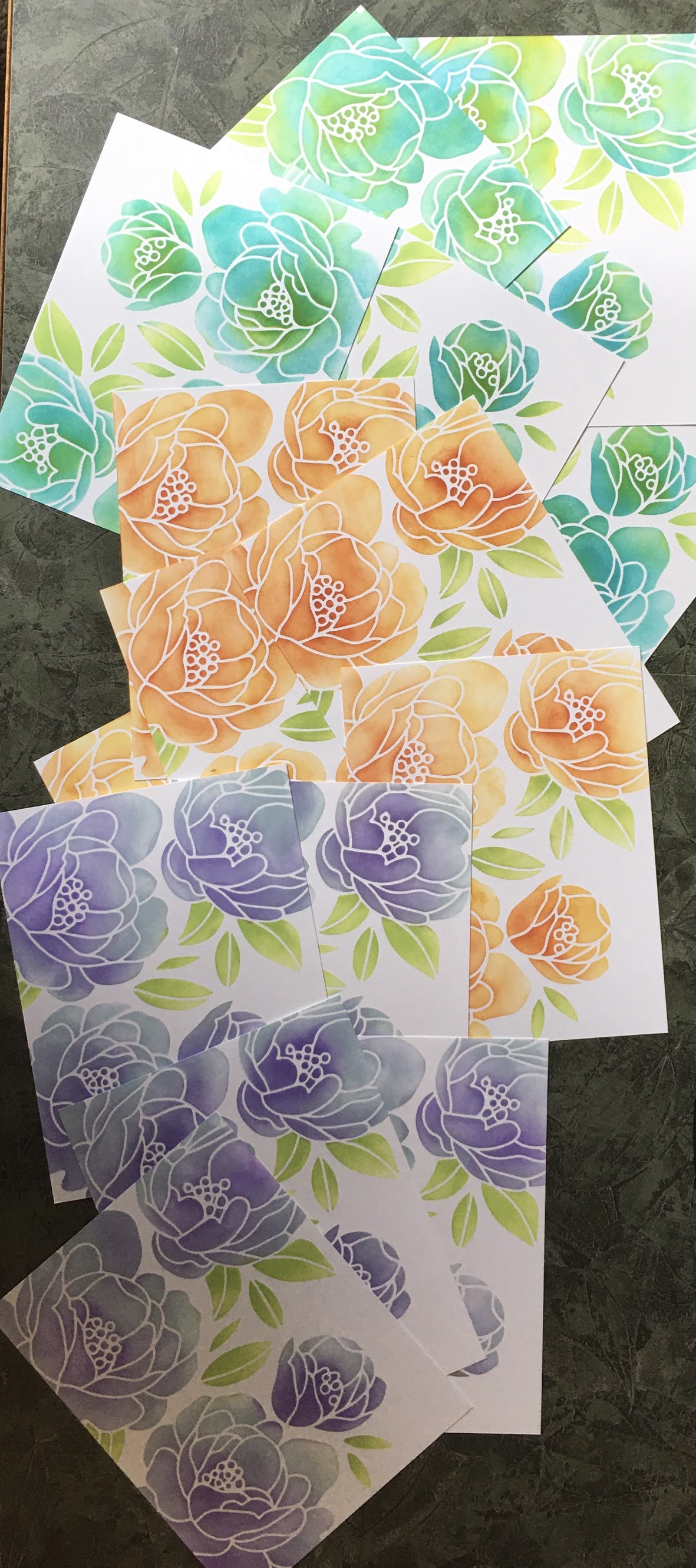
I started out by stamping and gold embossing the image onto 4 of the different pieces of cardstock. On the 5th, I stamped in white pigment ink.


I thought I would color the floral images on this stamp with Zig Clean Color markers, and they worked great on most of these. They don't show up well on dark colors though. On the black watercolor cardstock, I decided to use Iuile Watercolors, which show up so well on black. I used the paint from one of the dot cards.


It's really hard to show how glittery these beautiful watercolors are in real life. The are also a bit opaque, so they don't blend in quite the same way as regular watercolor.


On the Strathmore Toned Blue Mixed media cardstock, I chose some of the Turquoise colors from the Zig markers.


I really love how this one turned out. 


For the Strathmore Toned Tan Mixed Media cardstock, I chose dark oranges and red.


These lighter colored Mixed Media cardstocks worked beautifully with the Zig markers


For the Tim Holtz watercolor cardstock, I chose reds, pink and purple. For all of these last 4 cards, I embossed with gold embossing powder.


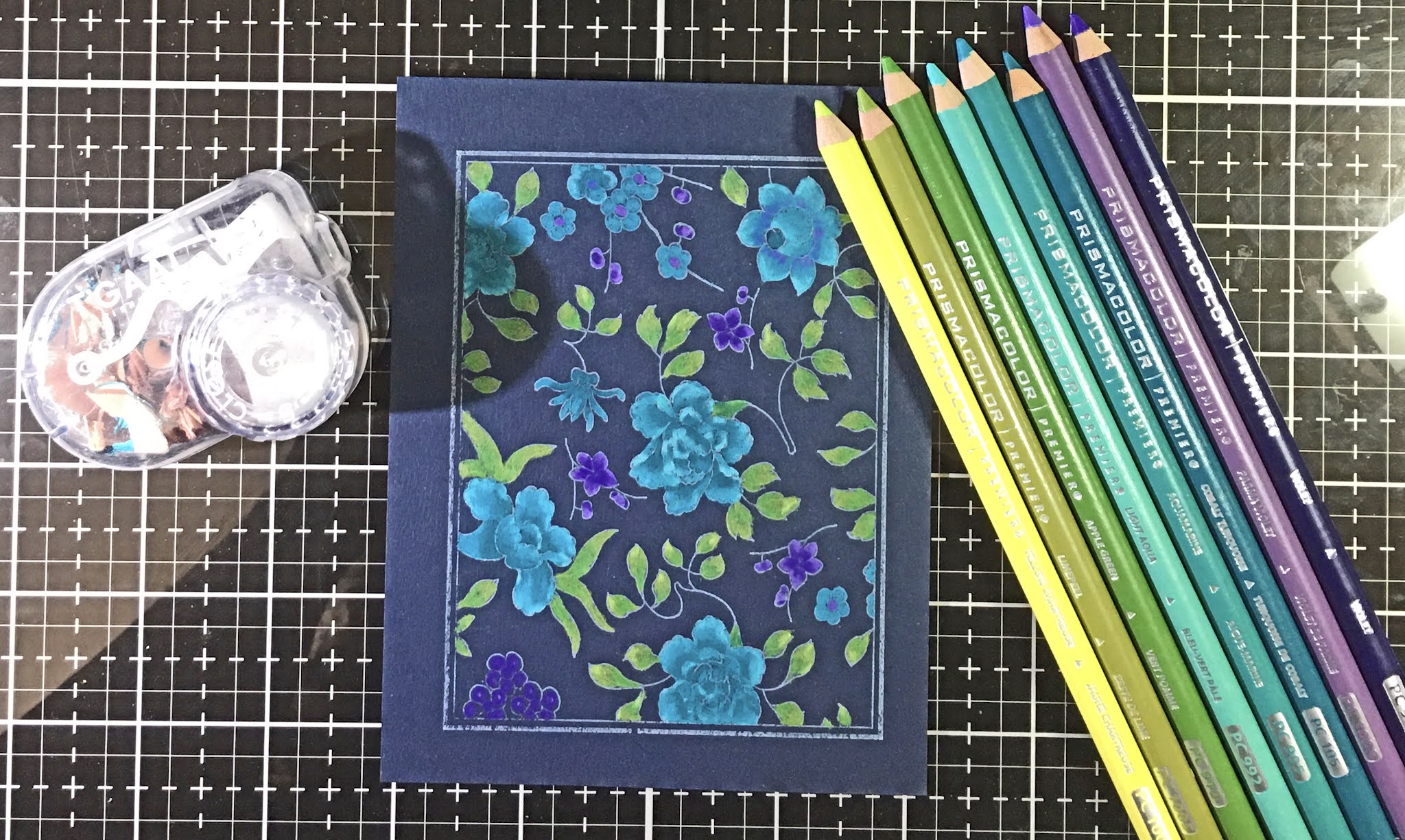
The final version of this card is shown at the top of this post. I used regular cardstock, and therefore chose colored pencils rather than a watercolor medium.


These are my favorite colors for this dark blue cardstock. This is how it looked before it was embossed.


This is how the panel that I colored with pencils looked after I put it back into my stamp platform and stamped over the coloring with Versamark ink. I embossed this one with JudiKins Silver Detail embossing powder. The card at the very top of this post was taken in brighter light and shows off the colors better.


Here are all of them with their chosen colors for matting. To finish the panels off with a sentiment, I added a Happy Birthday sentiment on vellum. I couldn't bear to cover up any of these pretty patterns. (And yes, I needed a bunch of birthday cards this month)  

The banners were die cut using a sweet little banner die which is included The Greetery Crimped Slimline die set. The Birthday stamp is from my cut up version of the Magenta Multilingual Happy Birthday stamp.


I promised to tell you the origin story of this stamp. This pattern came from a piece of china that belonged to Susie Tracy's mother. Susie is the former owner of Art 'n Soul, and a good friend of mine, and also of Helene, who owns Magenta. When Helene was visiting Susie one time, she took a photograph of the china, and voila! This beautiful stamp was born.

Magenta Products used:

Other Products used:

Blue Colored Pencil card:
Prismacolor Pencils: PC992 Aqua,
PC905 Aquamarine, PC105 Cobalt Turquoise
PC1008 Parma Violet, PC932 Violet, 
PC1004 Yellow Chartreuse, PC1005 Limepeel,
PC912 Apple Green
PTI Dark Indigo cardstock
DCWV Foiled Silver cardstock
Versamark ink
JudiKins Detail Silver embossing powder
The Greetery Crimped Frame die
The Greetery Crimped Slimline die set
Translucent Vellum

Iuile Watercolors on Black
Stonehenge Black Watercolor Cardstock
Curious Metallic Super Gold Cardstock
Versamark ink
Ranger Gold embossing powder
The Greetery Crimped Frame die
The Greetery Crimped Slimline die set
Translucent Vellum

Toned Blue Card with Zig Markers
Strathmore Toned Blue Mixed Media Cardstock
So Silk Glamour Green Cardstock
Zig Clean Color Markers used: 042 Turquoise Green,
033 Persian Green, 047 May Green,
050 Yellow, 084 Deep Violet
Versamark ink
Ranger Gold embossing powder
The Greetery Crimped Frame die
The Greetery Crimped Slimline die set
Translucent Vellum

Toned Tan Card with Zig Markers
Strathmore Toned Tan Mixed Media Cardstock
PTI Terracotta Tile Cardstock
Zig Clean Color Markers used: 047 May Green,
060 Brown, 070 Orange, 
029 Geranium Red, 023 Scarlet Red
Versamark ink
Ranger Gold embossing powder
The Greetery Crimped Frame die
The Greetery Crimped Slimline die set
Translucent Vellum

White Card with Zig Markers
Tim Holtz Watercolor Cardstock
PTI Pure Poppy Cardstock
Zig Clean Color Markers used: 047 May Green,
029 Geranium Red, 021 Light Carmine,
080 Violet
Versamark ink
Ranger Gold embossing powder
The Greetery Crimped Frame die
The Greetery Crimped Slimline die set
Translucent Vellum