Pages

Thursday, March 30, 2017

Technique of the Week: Painting Your Stamps with Nuance

This post is in conjunction with the Art 'n Soul Newsletter  article, "Technique of the Week". This card and technique is also featured on the Magenta blog right now.


The stamp I chose was the beautiful Clover Silhouette designed by the talented Ellie Knoll. You could use any stamp that has a lot of solid surface, rather than outlines. I also chose to use some of the newest colors of Nuance, but really any colors of Nuance would also look great.

   
I used the MC27 Round Shape Mask for this technique. You get two pieces with this template: the outside of the circle, which covers your card and leaves the circle open to work in; and the circle itself.

I taped down my card panel and taped down the outer piece of the stencil over it, leaving the circle open to stamp in. 


I put Nuance powder onto my craft mat in little piles. I inked the stamp with Versamark ink (clear, sticky ink) to help the colors stick. Then, using a damp brush, I picked up Nuance powder from my mat and painted it onto the solid areas of the stamp.


I spritzed the stamp to activate the color, and stamped it onto a piece of watercolor cardstock. I stamped off onto a second piece of cardstock, and then repeated the process to have a second image on my card.

The template masked off the area around the stamping. 

The panel that I stamped off onto will make a second card, but the image will be a little lighter.


Once I had stamped the image twice, I removed the template and dried the image carefully. I placed the inside of the template (the circle) over the stamped images to mask them. I then tapped Nuance powder all around the circular mask, and spritzed the powder with water.


You could also do the outside of the circle first; it works either way.


To define the circle around the main image further, I first dried the background, and then placed the template with the open circle back on the panel, and drew around the circle with a green Micron pen.


I sprayed water onto the rest of the Nuance on my mat, and picked up some with a brush and flicked spots onto the background image. Last, I added a sentiment and mounted it to a card.

At the end, not wanting to waste the wet Nuance that was left on my mat, I dragged another piece of watercolor cardstock through it, and created a background for another card.


This technique was really fun, and was not hard to do. Try it out on any stamps you may have with a lot of solid surface.

Magenta Products Used:
(If you are local, please look for products at Art 'n Soul. If you are not local and wish to find Magenta products, you can click on the link in the stamp or product name below each image, or you can visit the Magenta online store here).


48.011.L Clover Silhouette

07.952.F Sending you Sunshine

MC27 Round Shape Mask

MNU026 Old Rose

MNU027 Chartreuse

MNU028 Bright Green

MNU029 Lagoon

MNU030 Anthracite
Other Products Used:
Distress Inks: Mowed Lawn & Peacock Feathers (for stamping sentiment)
Green Micron 01 Pen
Perfect Pearls powder (mixed into water)
Watercolor cardstock
Painter's tape and Post-it tape for masking


Thursday, March 23, 2017

Technique of the Week: Split Cards

This post is in conjunction with the Art 'n Soul newsletter article for Technique of the Week. I adapted this card from a post on Jennifer McGuire's blog. I love the idea of being able to make two cards at almost the same time.


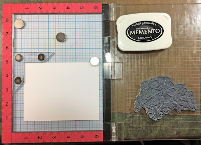
To do this technique, you need to be able to stamp your image in the same spot on two different pieces of cardstock. The easiest way to do this is to use a MISTI stamping tool, or similar product.


I used my new stamp from Magenta, 44.024.Q, Zen Bouquet, and arranged it in the MISTI toward the bottom of a piece of pink cardstock cut to 4.25" x 5.5". I stamped with Versamark ink and embossed it with clear embossing powder.


I then put a piece of Neenah Solar White 80# cardstock cut to the same size into the MISTI, and stamped the image with Memento Tuxedo Black ink, which is a Copic friendly ink. 


It's been a while since I busted out my Copic markers, but it was really fun to get them out and use them again. I chose Copic colors RV32, RV34, and V06 for the pinks; YR12, YR16, and YR18 for the oranges, and YG93, YG95, and YG97 for the leaves.


I am by no means an expert Copic user, but the way I learned to color with them is to use 2 or 3 colors in the same general hue, and use the lightest color first to color all over. Then add the medium color in areas you want darker. Go back to the lightest and color all over; then add the darkest in areas you want dark. Then blend with the medium. Don't color too large an area with one color because if it dries it's harder to blend. If you just use 2 colors, that's perfectly ok too.


I was very much enjoying coloring the blossoms and started with the pinks; then moved on to the oranges.


It was after this that things went horribly wrong. I was thinking of adding some purples and I tested some colors on a scrap piece of cardstock, completely unaware that my scrap was resting OVER my card panel. If you know anything about Copics, you know that one drawback of them is that they do bleed through your paper.


I tried everything I could think of to fix the problem, including a sand eraser and a Copic 0 blender. Everything I tried just made things worse. I mean, there was going to be no covering this with a sequin! I literally did not have time to start over, and still make my blog post deadline.

I ended up cutting my cardstock straight in from the edges on either side until I reached the top of the large blossom, and then fussy cut along the top of the blossom. This got rid of the offending stain. I added pink cardstock at the top and stamped my sentiment there.

Before I fixed the top of the white card, I put both cards together and cut them in two about halfway through the stamped images. The cut was in the same place on both cards. This gave me 4 pieces to mix and match up onto 2 cards - two colored pieces, and two plain, embossed pieces.

To complete the cards, I stamped a sentiment that I designed for Magenta for the new Spring collection, 07.968.H "You are Amazing just the way you are" in Versafine Onyx Black ink. I added a few sequins and some dots with the Pico Embellisher. I added a gold peel off strip between the top pink panel and the bottom colored panel on one card, and added a bit more of the pink cardstock at the top to compensate for the part I had to cut away.


I really like how these fraternal twins turned out, and I love this sentiment that I think really goes with the overall theme of the cards. Whether you are brightly colored or more plain, you are Amazing just the way you are!


I hope you will give this technique a try. The hardest thing about it was cutting into my coloring. You do not have to use Copics to color. You can use other markers, or color pencils. You can also use watercolors if you use watercolor cardstock.

Magenta Products Used:
(If you are local, please look for products at Art 'n Soul. If you are not local and wish to find Magenta products, you can click on the link in the stamp or product name below each image, or you can visit the Magenta online store here).

44.024.Q Zen Bouquet

07.971.F Sending hugs

Other Products Used:
Copic Markers:
RV32, RV34, V06,
YR12, YR16, YR18,
YG93, YG95, YG97

Versamark ink
Memento Tuxedo Black ink
Versafine Onyx Black ink
Clear embossing powder
Pico Embellisher, Wedding Dress
Tickles and various sequins

Zen Bouquet

These cards use some new stamps coming out in the Magenta 2017 Spring Collection, and are being featured on the Magenta blog today. 

The Zen Bouquet stamp is my latest design in the Magenta Zentangle inspired doodle art stamps, and the "you are Amazing" stamp is also my design.


I made this stamp because I love to color, but here I have two cards for you showing that you can use them without having to color the individual blossoms. 


In both cards, I made the backgrounds with Nuance, and sprayed with water mixed with Perfect Pearls powder. The first one is various blues, with a little Raspberry and green; and on the second one, I used some warm colors and some greens and blues as well.


I made the Nuance backgrounds first, and then once they were dry, I stamped the Zen Bouquet stamp and the sentiments with Versamark ink, and embossed with White Diamond embossing powder.


Both panels were die cut from Tim Holtz watercolor cardstock, with a stitched rectangle die to a size of 4" x 5.25". They were both matted with a piece of Black So Silk cardstock and mounted onto an A2 card base of 110# Neenah Solar White cardstock.


Card #1:


Magenta Products Used:
(If you are local, please look for products at Art 'n Soul. If you are not local and wish to find Magenta products, you can click on the link in the stamp or product name below each image, or you can visit the Magenta online store here).


44.024.Q Zen Bouquet


07.968.H You are Amazing

MNU001 Turquoise

MNU007 Raspberry

MNU009 Grass Green

MNU011 Cerulean Blue

MNU013 Royal Blue

Other Products Used:
Versamark Ink
JudiKins White Diamond embossing powder
Perfect Pearls powder
Die-namics MFT-463 Blueprints 13 die set
Tim Holtz watercolor cardstock
Black So Silk cardstock
Various sequins

Card #2


Magenta Products Used:

(If you are local, please look for products at Art 'n Soul. If you are not local and wish to find Magenta products, you can click on the link in the stamp or product name below each image, or you can visit the Magenta online store here).


MNU021 Coral


MNU023 Berry


MNU027 Chartreuse


MNU029 Lagoon

Other Products Used:
Versamark Ink
JudiKins White Diamond embossing powder
Perfect Pearls powder
Die-namics MFT-463 Blueprints 13 die set
Tim Holtz watercolor cardstock
Black So Silk cardstock
Various sequins

Friday, March 10, 2017

Stencils, Nuance and Doodles

This post is in conjunction with my post on the Magenta blog today.

I used watercolor cardstock, the Crest 4-04 Stencil and some Nuance powder. First I placed the stencil onto the watercolor cardstock and sprinkled Nuance powder onto it, trying to concentrate the color in the openings. I lightly sprayed the Nuance to activate it, and it covered the stencil and the openings with beautiful color.


I carefully picked up the stencil and placed it wet-side down onto another piece of watercolor cardstock. The Nuance that was on the stencil transferred to my cardstock and made a mirror image of the first card.


I had the urge to Zentangle in the openings, so I drew lines around them first and then did different tangles in each space. I flicked some mica watercolor from Artquest onto each card and stamped sentiments with Versafine ink.

This is such a great stencil to use for Zentangles!

Magenta Products Used:
(If you are local, please look for products at Art 'n Soul. If you are not local and wish to find Magenta products, you can click on the link in the stamp or product name below each image, or you can visit the Magenta online store here).

Crest 4-04 Floral Crest

07.846.G

07.901.F Imagine

MNU001 Turquoise

MNU002 Bright Yellow

MNU004 Jade

MNU011 Cerulean Blue

MNU013 Royal Blue

Other Products Used:

Micron Black pen 01
Versafine Deep Lagoon ink
Versafine Onyx Black ink
Watercolor paper
Artquest Palette Metallics


SaveSave