Pages

Wednesday, August 20, 2014

The Love of Those Around You


I find that one of the hardest cards to make is a sympathy card.  I don't want to put too much into it, or too little.  I want it to be good enough, but not over the top.  A simple, but elegant design usually works best for me.  We never want to have to send this kind of card, but unfortunately, all too often, the occasion does arise.


This lovely feather from Magenta is the definition of elegant, and the sentiment is heartfelt.  The feather was stamped with Versamark and embossed with Judikins Silver Detail embossing powder.  The feather was colored in blue with mica watercolor.  The sentiment was stamped in Versafine Onyx black ink.  A tag was hand cut, and gems were sprinkled for a little extra touch.

Magenta stamps used:
42.191.K  Large Feather
07.817.H  May the Love of Those Around You

Other Items Used:
Versamark Ink
Versafine Onyx Black Ink
Judikins Silver Detail embossing powder
Stargazer Artquest Palette - Quasar Blue
Hero Arts Mixed Accents - Sea

Friday, August 1, 2014

August 2014 Magenta Challenge


August 2014 - Magenta Challenge :
My favorite Magenta Stamp!
Create a Card, a Layout or even an alterned object if you feel like it,
follow the theme and use at least one Magenta product :

papers, stamps, embellishment, Peel Off's, chipboard and more...

The Magenta Challenge for August is to use your favorite Magenta Stamp.  Since I love Magenta stamps so much, it's pretty hard for me to choose a favorite, so when I did this card, I just had to pick a current favorite.  I do love this stamp, although at the moment, I think the Multilingual Sentiments would probably top my list.  (You can see those on my blogposts here and here).


Here's my card, and you can see I used my current favorite technique, acrylic block stamping.  You can see a tutorial on this technique here.
Magenta stamp used:  07.861.K You Make My Heart Smile
Distress Inks:  Faded Jeans; Mustard Seed; Ripe Persimmon
Versafine Black Onyx Ink
Strathmore watercolor paper 140# cold press
Stardream Fuse Flame paper
Enamel Dots from My Mind's Eye
Tim Holtz Acrylic Grid Blocks

Now it's your turn!
One entry per person only!
you have until August 29th to enter!
Go here to submit your entry using In linkz


Wednesday, July 23, 2014

Awesome Summer Sunflower


Summertime is such a great time of year, with backyard barbecues, and summer gardens featuring sunflowers!  I love playing with this sunflower stamp from Magenta; it's a perfect size for a gorgeous card.  I sprayed two colors of Radiant Rain mists onto a 2" Inchie square, and stamped the sunflower onto the middle.  I stamped the sunflower again onto my card, and positioned the Inchie square over the stamped image.  The sentiment was stamped into the lower right, and gems were sprinkled around for some extra sparkle.


If you look at the Inchie square in the light, you can see the beautiful sparkle from the Radiant Rain.  The perfect backdrop for this great stamp.


Magenta stamps used:  42.210.P  Sunflower
07.876.F  You Are Awesome

Other Items used:
Radiant Rain Mists:  Spanish Moss & Ginger Peach
Versafine Onyx Black Ink
2" Inchie Artsquare
Hero Arts Mixed Accents in Foliage and Sunshine


Tuesday, July 22, 2014

Multilingual Sentiments

I wanted to do a quick post to show examples using the multilingual sentiments from Magenta.  The Christmas one is definitely going to be on my Christmas card this year.  For an example of the card I will probably do, please look at the last page of the Magenta Catalog supplement.  I also made a tag using it, and I just think it's beautiful however it's used.  The third sentiment in the block is Icelandic!


I sprayed through the new Magenta snowflake mask with Radiant Rain mist, and then pressed this shipping tag onto the wet mask to soak up the extra Radiant Rain.  The Multilingual Merry Christmas sentiment was stamped with Versafine ink.  Quick, easy and beautiful.

Magenta stamp used:  07.883.K  Multilingual Merry Christmas
Magenta Mask:  MC05 Snowflake Mask
Radiant Rain mist:  Bashful Blue
Versafine ink:  Deep Lagoon

Next is an example of the Multilingual Thank You stamp.  I have used this one quite a bit already, and I can see that this will become my go-to for quick Thank You cards.  The second sentiment in the block is Icelandic!


This one appears in the Magenta Catalog supplement, and it was made with one of my favorite techniques, acrylic block stamping.  I did a tutorial post on this technique here.  The sentiment was stamped with Versamark and embossed with Ranger Black Sparkle embossing powder.  This embossing is so beautiful in real life - the words sparkle with lots of different colors.  Before embossing, be sure your ink is dry and use an anti static tool such as the EK Success Powder Tool.

Magenta stamp used:  07.882.I  Multilingual Thank You
Distress Ink:  Picked Raspberry; Mustard Seed; Faded Jeans
Tim Holtz Acrylic Grid Block Set
Versamark Ink
EK Success Powder Tool
Ranger Black Sparkle embossing powder
Strathmore 140# cold press watercolor paper 

I really love these two stamps from Magenta, and I think you will too!


Tuesday, July 8, 2014

Magenta Fall and Winter 2014 Collection

Today is the day!  I'm over the moon thrilled about the new Magenta collection.  I am especially excited that Magenta used my idea for a couple of multi-lingual sentiment stamps.  We have "Thank You" and "Merry Christmas" in a variety of languages.  Choosing which to use was hard, and we wish we could have used them all!  One that I was sure I wanted was Icelandic, and Magenta graciously agreed.  It makes me giddy every time I see these stamps!


I feel this way about the whole new collection, honestly.  Wait until you see the adorable chubby birds!  Susie Tracy and I were also honored to have some of our sample cards published in this supplement. Click on the link below to view the catalog, and let me know what you think!

If you are local, we are taking orders at the shop right now for these new stamps!  Please come in or call to place your order.  If you are not local, you can order these from your local retailer, or directly from Magenta.  Enjoy!

Friday, July 4, 2014

Splash Inks!

In conjunction with the Art 'n Soul newsletter Technique of the Week, this beautiful little card was made using Splash Inks.  Splash Inks are acrylic based inks that come in a pack of 4 different colors:  Yellow, Magenta, Cyan and Black, which are the same colors used in printers.  They are made with pigments suspended in a fine acrylic emulsion, and they can be used to mix an infinite variety of colors without getting muddy.  Each set of inks comes with a recipe card to mix over 300 different colors.


This card was made in a class given by Lisa Lee of Inchie Arts.  We used a Twinchie (2" art board square), and liberally sprayed it with water.  We added one drop of each of two Splash Ink colors to the wet art board, and then didn't touch them until they dried.  It took some time for the wet board to completely dry - probably at least an hour.  Once they were dry, we put Versamark ink on them and embossed with clear embossing powder.  We repeated the embossing process a couple of times until the squares were smooth and shiny.  Just mount these to a card, add a sentiment and you are done! (Although Susie has been experimenting with stamping on top of the inked art board.  Stay tuned for some inky fun at Art 'n Soul on play day, July 12th.

Stamp:  Magenta - 07.730.H  I am in love with this day
Inchie Arts Twinchie Square
Splash Inks
Enamel Dots from My Minds Eye
Versamark Ink
Detail Clear embossing powder from JudiKins
Versafine Onyx Black Ink

Thursday, July 3, 2014

Magenta Give Away!


Magenta wants to say Thank You to all of its faithful followers
and at the same time give you a sneak peak
of our upcoming Collection which will be available soon!

You could win the following prize!
Simply follow us on our Blog or Facebook and use the widget here on the Magenta blog enter!
You have until July 30th to enter!


You are going to LOVE the new collection!!

Sunday, June 22, 2014

One Layer Card

At Art 'n Soul's play day last Friday, the theme was one layer cards.  Sue was there with a lot of cards that she made to show different ways you can make a one layer card really pop.  Her cards were still on display at the shop as of today, and they exhibit a treasure trove of great techniques.  This is the card I made to showcase the theme.  I can't get away from playing with Distress watercolor, but when using a piece of watercolor paper, it's never just a one layer card.  I decided to try the acrylic block stamping technique on a piece of Neenah Solar White card stock.


 I'm pretty happy with how it turned out.  I masked off the area to be inked with post it notes and put some Distress Ink on a small scallop shaped acrylic block.  I spritzed it with a little less water than usual and stamped on the left.  I spritzed once more and stamped in the middle; and spritzed one final time and stamped on the right.  The ink lasted pretty well on the block, but you can see it's darker on the left than the right.

For the background colors I used Tumbled Glass and Mustard Seed.  For the leaf stampings I used Broken China, Dried Marigold and Peeled Paint.  I dried the ink right away with a heat gun, and there was minimal warping of the paper.  Per a tip from Sue, I scored above and below the background stamping, after removing the masks.  The leaves were then stamped, and yes, I stamped them over the score lines.  Sentiment was stamped with Versafine Onyx Black ink.  I resisted the temptation to put gems on the card at the end.  This is a very mailable card!  By the way, the blue rim around the card is just the paper it was photographed on.  I did not mat the image - it is truly a one layer card.

Magenta Stamps used: 
 0684.F  Poplar Leaf
  07.806.K  Sending you warm thoughts

Distress Inks used:
Tumbled Glass
Mustard Seed
Broken China
Dried Marigold
Peeled Paint

Other:
Versafine Onyx Black Ink
Martha Stewart small scor board
Neenah solar white card stock 110#

Thursday, June 19, 2014

Technique of the Week: Distress Watercolor

We have a new Technique of the Week featured in the Art 'n Soul newsletter this week, and in conjunction with that, I have made a picture tutorial here on my blog to better illustrate it.  This is another watercolor technique that we had fun with on an Art 'n Soul Watercolor Play Day, and that I previously featured on the blog here.

I assembled some Distress Inks (here I used Picked Raspberry, Squeezed Lemonade, and Peacock Feathers) with some mini blender tools.  I chose a favorite Magenta stamp that was large enough to cover some of the area, but not too much.  Stamps that cover most of the area on your card are still pretty, but you get less color that way.  I used Tim Holtz Distress watercolor card stock.  I like this watercolor paper, because it's good quality, it's already cut to size, and it's white instead of cream color.  It's about 118# paper.  I also like Strathmore 140# cold pressed paper.


I stamped the  Bloom and Flourish image in Versamark ink (on the smooth side of the paper), and embossed using JudiKins White Diamond embossing powder.  I love the sparkle that this powder gives to an image.


I applied the three Distress colors using mini blending tools.  The embossed image resists the color, and really stands out beautifully.


I applied some of each of the 3 colors randomly around the card


You don't have to blend these colors at all.  The blending will happen when you spray it with water


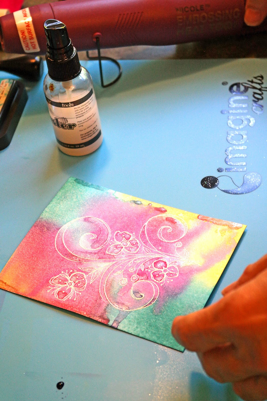
After applying the color, I spritzed the card stock liberally with water mixed with Perfect Pearls Pearl.  In a 2 oz bottle like this one, I usually put about 1/4 tsp of the Perfect Pearls powder into a full bottle of water.  If you use too much, you can clog your sprayer.  The Perfect Pearls adds a beautiful sheen to your project.


Once I sprayed the card stock, the ink beaded up and began to run. You can tip the card stock to let it run together as much as you want, and until you are happy with it.


You can then either leave it to dry naturally, or you can dry it with a heat tool.  Since I'm impatient, I usually dry it with the heat tool.


I really love how this turns out, and it's so easy to do!


BONUS TUTORIAL

I love, love sentiment stamps (especially Magenta ones), but they don't always fit on my card in the way that I want.  You can adjust how your sentiments go onto your card using a stamp positioner.  There are a number of these on the market, and yours may have a name like Stamp-a-ma-Jig or "The Big Ugly".  Here I'm using one from Inkadinkadoo.


This positioner comes with two parts:  a small T-square, and a square piece of plastic.  The first step is to stamp your image onto the plastic square


The plastic should be positioned into the "T" of the T square, with the rough side facing up.  Ink up your stamp, and stamp onto the corner of the plastic, with the stamp fitting into the "T" as shown.


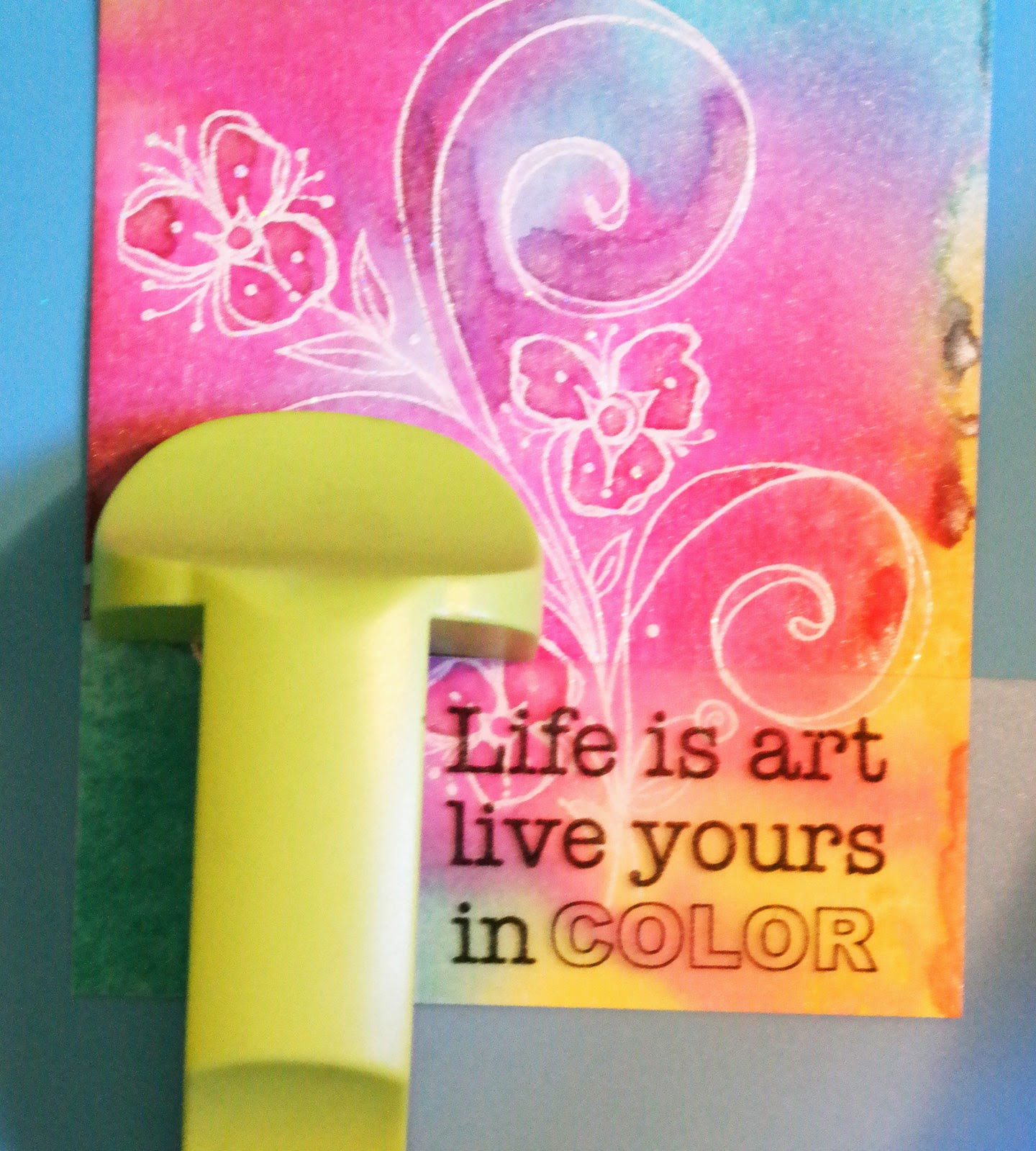
 You can then easily position your sentiment onto your card, because you can see through the plastic to see where you want each part of the sentiment to go.  In this case, I wanted "Life is art" to go at the top; and then Live yours in COLOR" to go at the bottom


Once you have figured out where you want the sentiment to go, put the T-square portion of the positioner so that the corner of the plastic square fits snugly up into the corner of the "T".  Then without moving your paper, remove the plastic square.


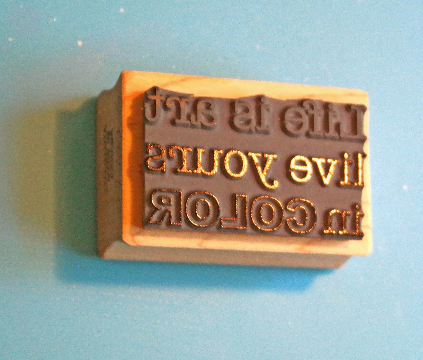
On your stamp, tape over the portion of the sentiment that you are not going to use in this first position.  Just use regular tape for this; it won't hurt your stamp


Ink up your stamp.  In this case, I used Versafine Onyx black ink.  Sometimes I have difficulty with some inks stamping onto watercolor card stock, but I find that the Versafine works well.  The tape prevents you from inking the part of the sentiment that you are not using.


Remove the tape, and here you can see that only the first line of the sentiment is inked.


Fit your stamp carefully into the "T" of the positioner, and press down well.


The portion of the sentiment that I wanted at the top of the card is now perfectly positioned where I wanted it.


Next put the plastic square back onto the card to see where to put the rest of the sentiment.  Since I want "live yours in COLOR" at the bottom, I arranged it where I wanted it and put the "T" part of the tool in place.  Remove the plastic square to stamp.


 Tape over the part of the sentiment not needed in this position, and ink up the stamp


Remove the tape and only the portion you need will be inked


Stamp the inked sentiment onto your card by positioning the stamp into the corner of the "T"


I matted the card stock with a slightly larger piece of So Silk Beauty Pink, and mounted it onto an A2 size card.  Some enamel dots were added from My Mind's Eye.  Here is the finished card.


There is a lot of sparkle in the white embossing from the White Diamond embossing powder, and there is a beautiful sheen in the colors from the Perfect Pearl that was added to the water.

I hope you try this technique.  It's fun, easy, quick, and creates a beautiful and very mailable card.

Magenta Stamps used:
P.0536  Bloom & Flourishes
07.700.G  Life is Art

Distress Inks:  Picked Raspberry; Peacock Feathers; Squeezed Lemonade
Versafine Onyx Black Ink
JudiKins White Diamond Embossing Powder
Tim Holtz Watercolor cardstock
So Silk Beauty Pink card stock
Perfect Pearls Pearl
Enamel Dots from My Mind's Eye - "Ashbury Park"


Friday, June 13, 2014

Acrylic Block Stamping

In conjunction with the Art 'n Soul newsletter each week, we are going to try to present a tutorial on a new technique.  I have had a lot of people ask me about watercolor stamping using dye based ink pads and acrylic blocks.  I first showed this technique on my blog here.  One of the most frequent questions I have had since this posting is where did I get the round acrylic block I used on those cards, and I'm sorry, but I really don't recall, and I have not been able to find this exact block in a web search.  I decided to try this technique using square and rectangular blocks to show that it's beautiful in any shape.

First I assembled some Distress Inks and some pieces of watercolor paper (Strathmore 140 # cold press).  I think any dye based ink will work for this technique, but I particularly like Distress Ink.  I think the colors stay very true.

I cut 2 pieces each of the same size paper, that would be appropriate sizes for the acrylic blocks I was using.  The blocks I chose to use are the Tim Holtz 9-piece acrylic block set.  I chose this set because it comes in a lot of sizes in squares and rectangles.
Tim Holtz set of 9 acrylic blocks

First I applied ink directly from the Distress pads onto the acrylic block.  My first try was using 3 colors, but I found I liked the results better using only 2.  Be sure to apply the colors in separate places on your block so that you don't mix your colors on your pad.  If you can't avoid that,  just be sure to use the lightest colors first.


In this example, I used Distress Inks in Mustard Seed and Seedless Preserves.  After applying the ink to the block, spritz water onto the ink, pretty liberally, but not so much that when you turn the block over the ink will drip off.  I like to mix about 1/4 tsp of Perfect Pearls Pearl into my spritzer bottle.  This will add a beautiful glimmer to your colors


When your ink is beading up and starting to run together, turn your block over and stamp onto your watercolor paper.  Press down hard and leave it on the paper for a minute to allow the color to soak in as much as possible.


I noticed when using these blocks, which have grid etched into them, that the grid actually shows up in the stamping.  I loved that look, and made sure that the side I was using was the etched side.


There was still ink on the block after stamping once, and this is the reason that I cut two pieces of paper.  I spritzed the block and stamped again.


In many cases, I preferred the second stamping, and the grid showed up even better on the second piece.


If there are dark blobs of ink that you don't like, just touch a clean paper towel to them to blot them up


I can now stamp on any of these, and they will make gorgeous cards


These are all of my experiments (first and second stampings).  Besides the first two colors of Distress Ink, I also used  Picked Raspberry, and Chipped Sapphire.

Notice in the above photo that I still have ink on my block; also notice the second stamping in the top piece is a little light?  I spritzed my block once more and applied it to the second stamping on the top.  Since the previous ink had dried, this just added another layer of color, and I really like how it turned out.  Just have fun with it and experiment.


I made this card with the second stamping of the larger piece above.

Stamps used:
Magenta 0684.F  Poplar Leaf
Magenta 07.875.F  Always

Stamping was done with Distress Inks:
Shabby Shutters
Dusty Concord
Forest Moss

Gems are from Hero Arts Pearls & Gems Mixed Accents - Foliage and Floral

I hope you give this a try!