Pages

Showing posts with label Magenta 07.954.G Think about you often. Show all posts

Monday, July 10, 2017

Thinking About Summer

For this card I used one of my favorite Magenta stamps: Clover Silhouette, designed by Magenta DT member Ellie Knol. This post is also on the Magenta Blog today.


On watercolor cardstock I sprinkled some Nuance powder in the general areas that I planned to stamp. I inked the stamp with Memento Gray Flannel ink and spritzed it with water, then stamped it in the areas where the Nuance had been sprinkled. I stamped it twice, spritzing the stamp once more in between stamping. I lightly spritzed some water to activate the rest of the powder on the card. I added some circles with Memento Teal Zeal ink, using a finger dauber and the Bubble Path Duo stencil.

I added the sentiment by stamping onto a strip of vellum with Distress Oxide Broken China ink. I embossed the sentiment with JudiKins Iridescent Sparkle embossing powder. I wrapped the vellum strip around the back of the watercolor panel and taped it down. I also put dots of Ranger Multi Medium Matte adhesive behind the sentiment to stick it down without showing from the front.

Magenta Products Used:
(If you are local, please look for products at Art 'n Soul. If you are not local and wish to find Magenta products, you can click on the link in the stamp or product name below each image, or you can visit the Magenta online store here).

48.011.L Clover Silhouette
07.954.G Think about you often
TM179 Bubble Path Duo
MNU001 Turquoise
MNU007 Raspberry

Other Products used:
Memento ink: Gray Flannel; Teal Zeal
Distress Oxide: Broken China
JudiKins Iridescent Sparkle embossing powder
Die-namics MFT-463 Blueprints 13
So Silk Glamour Green cardstock
various sequins

Thursday, June 1, 2017

Technique of the Week: Painting with Oxide Inks

This article is in conjunction with the Art 'n Soul newsletter article "Technique of the Week". To continue our postings using the very popular Distress Oxide inks, I decided to try and see how these inks would work if I painted with them. By the way, we have all of the Oxide colors in stock at Art 'n Soul as of the date of this email. We absolutely love these inks and how they work. Not that we would give up regular Distress inks... they are different.


To begin I cut a panel of watercolor cardstock with the second largest die of the Memory Box Postage Rectangle Layers 30052. 


I selected the Magenta background stamp  14.660.R, and stamped it with Versamark ink and embossed it with JudiKins Iridescent Sparkle embossing powder. 


I chose Broken China and Wilted Violet Oxide inks to start and pressed them onto an acrylic block and added water. 


I painted the centers with the Broken China first, then added Wilted Violet. 


Once all the flowers were painted, I added some Peeled Paint Oxide to the block and painted the leaves.


I watered down the Broken China color a lot and painted it all around the images. 


I colored the berries or buds in with a glitter pen.


One of the things I noticed about painting with Oxides is the same thing I have seen when blending with them. Oxides are a hybrid of dye and pigment, and while the dye soaks into your paper, the pigment sits on top. This makes them more opaque than regular Distress ink. The colors are beautiful, but getting shading is not easy.

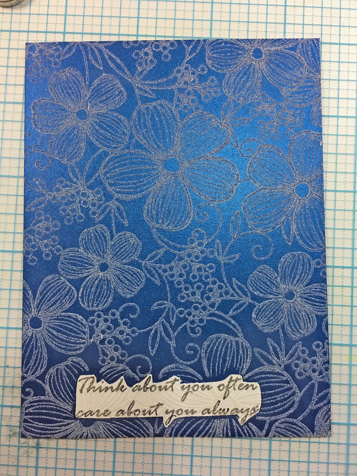
After painting the images and letting it dry, I selected a Magenta sentiment 07.954.G Think about you often. I chose a panel of So Silk Fair Blue cut to 4" x 5.25" and stamped the sentiment at the bottom of the panel with Versamark ink. I embossed it with JudiKins White Diamond embossing powder. 


Since I wanted to stamp my background stamp on this panel, I decided to mask my sentiment. I stamped the sentiment onto some JudiKins Eclipse masking paper. By the way, this masking paper is the best out there, and it is now available again. We just got a few rolls in stock at the shop.


I fussy cut the sentiment out of the masking paper and applied it to the panel. I then stamped the background stamp with Versamark ink over the entire panel. 


I embossed it with clear embossing powder and then removed the mask over my sentiment.


For mounting the watercolored panel, I decided to pop it up, so I used the Hero Arts Infinity Nesting Rectangle Dies DI198. This set has so many sizes of rectangles that you should be able to find the right size for most anything. There are 16 dies with 0.125" between each one, and the largest is 4.25" x 5.5". I found the perfect size to use to cut a piece of fun foam for the back of my watercolored panel.


I don't like the white sides of the fun foam to show, so I colored the sides with a dark blue Copic marker (B26). The fun foam creates a solid backing for the panel. I adhered the pieces to the background panel (using scor tape), and adhered it all to a white base card. I sprinkled a few sequins.

I really love the Distress Oxide inks for so many things; but at the end of the day, I would say that I think that regular Distress inks are better for watercoloring. Since the dye inks soak into the paper, they are more transparent, and shade more easily. It's nice to know thought, that if you just have one or the other, you can watercolor with all of them.


Magenta Products Used:

(If you are local, please look for products at Art 'n Soul. If you are not local and wish to find Magenta products, you can click on the link in the stamp or product name below each image, or you can visit the Magenta online store here).

14.660.R Floral Background

07.954.G Think about you often

Other Products Used:
Memory Box 30052 Postage Rectangle Layers
Hero Arts DI198 Infinity Nesting Rectangle Dies
Distress Oxide inks: 
Broken China, Wilted Violet, Peeled Paint
JudiKins White Diamond embossing powder
JudiKins Iridescent Sparkle embossing powder
JudiKins Clear Detail embossing powder
Tim Holtz watercolor cardstock
So Silk Fair Blue cardstock
Neenah Solar White 110# cardstock
Fun Foam
Copic marker B26
Eclipse masking paper
Scor tape

Friday, February 17, 2017

Technique of the Week: Smooshing Revisited

This post is in conjunction with the Art 'n Soul Newsletter article Technique of the Week.

Made with Nuance by Magenta

I have shown you "smooshing" before, but this time I'm taking it up a notch. You can view my previous posts on smooshing here and here.

Made with Distress Ink
Smooshing is applying ink onto your panel using a piece of acetate. It creates very interesting backgrounds on which you can stamp. The piece of acetate I used was cut from some packaging.

This time, instead of applying color to a blank panel, I stamped and embossed an image first, using White Diamond embossing powder by JudiKins.

My panel was cut from Tim Holtz watercolor cardstock, using the largest die in the set LF768, Lawn Fawn Small Stitched Rectangle Stackables. This die gives a stitched edge around a panel 3.75" x 5". If you don't have this die, you can just cut your panel to this size with a paper cutter. this is the perfect size to be able to mat with a colored piece of cardstock before you mount it to an A2 size card.

Also of note is that I like the Tim Holtz watercolor cardstock because it's white. When I mount it onto my base card, which is also white, it coordinates well.


Note in the above image that I'm using one of the new MISTI Creative Corners. I LOVE these! This way if I'm using a large stamp, and it comes close to the edge of my panel, I can set it away from the ruler edge of the MISTI. I don't seem to get a good image when my stamp is close to that edge. This corner is being used in the mini MISTI by the way, and works just fine.

I also decided to try Smooshing using Distress ink on one panel and Nuance on a second panel with the same stamp. I'm using Distress first.

Magenta Stamp 14.639.P Three Flowers, Distress ink in
Wilted Violet, Blueprint Sketch and Cracked Pistachio

Another difference this time is I applied the ink to my craft mat and sprayed it with Pearly Water (1/4 tsp Perfect Pearls Powder mixed with 2 oz water). Last time I applied the ink directly to the acetate and sprayed it there. I think this new way I can get better control over which color I'm using at any given time.

Wilted Violet first


After picking up the ink with the acetate, I dabbed it around on the panel, taking care to apply it to the embossed flower areas.


Picking up additional colors with the acetate, I continued to dab ink around the embossed image.


As the ink is added, the image pops out of the layers of color. I noticed that the Distress ink has a transparent look to it so that you can see layers through layers.


Next I decided to try Nuance, used the same way. I chose Raspberry, Cerulean Blue, and Aquamarine.


I tapped the powders onto my craft mat and sprayed with Pearly Water.


The first thing I noticed is that the colors are darker and more vibrant. You can probably get lighter colors if you spray the powder with more water. In order to get the colors to spread out onto the embossed areas, I occasionally scraped the puddles of water with the edge of the acetate.


I continued applying the different colors. I noticed that the Nuance seems more opaque than the Distress ink. I love the vibrancy of the Nuance.


At the end, I used a paintbrush just a bit on both the Distress and Nuance panels to be sure color got where I wanted it around the embossing.


Here are both of the panels, Distress on the left and Nuance on the right. They are completely different, and I love them both.

I added the sentiments last, using Magenta stamp 07.954.G Think about you often (one of my favorite sentiments). On the Nuance panel, I stamped with Nuance and embossed with JudiKins White Diamond embossing powder, just as I had for the main image. This step could easily have been done when I stamped the flowers. 


On the Distress card, I decided to stamp the sentiment with Wilted Violet Distress ink to match the main image. One of the many things I love about the MISTI tool is that now we can actually stamp with Distress and not worry that it will be too faint or blotchy. You just keep inking and stamping until you are happy with the color. 

Note that here I am again using one of the MISTI Creative Corners (in the mini MISTI). This sets the panel away from the hard side and bottom of the MISTI and allows for a better stamping.

I hope you try this smooshing technique to color your stamped and embossed images. It's easy and it's fun, and you can probably use things you already have around.

Magenta Products Used:
(If you are local, please look for products at Art 'n Soul. If you are not local and wish to find Magenta products, you can click on the link in the stamp or product name below each image, or you can visit the Magenta online store here).

Three Flowers 14.639.P

Think about you often 07.954.G
Nuance colors:
MNU007 Raspberry
MNU011 Cerulean Blue
MNU020 Aquamarine

Other Products Used:
Tim Holtz Watercolor cardstock
Distress ink: Wilted Violet, Blueprint Sketch, Cracked Pistachio
Perfect Pearls Powder
Scrap of Acetate
Versamark ink
JudiKins White Diamond embossing powder
Lawn Fawn LF768 Small Stitched Rectangle Stackables
So Silk Fair Blue cardstock (for matting)
So Silk Passion Purple cardstock (for matting)
Neenah Solar White 110# cardstock (for base cards)
sequins from Neat & Tangled


Tuesday, March 29, 2016

Think about you often...

My post on the Magenta blog for Wednesday, March 30!

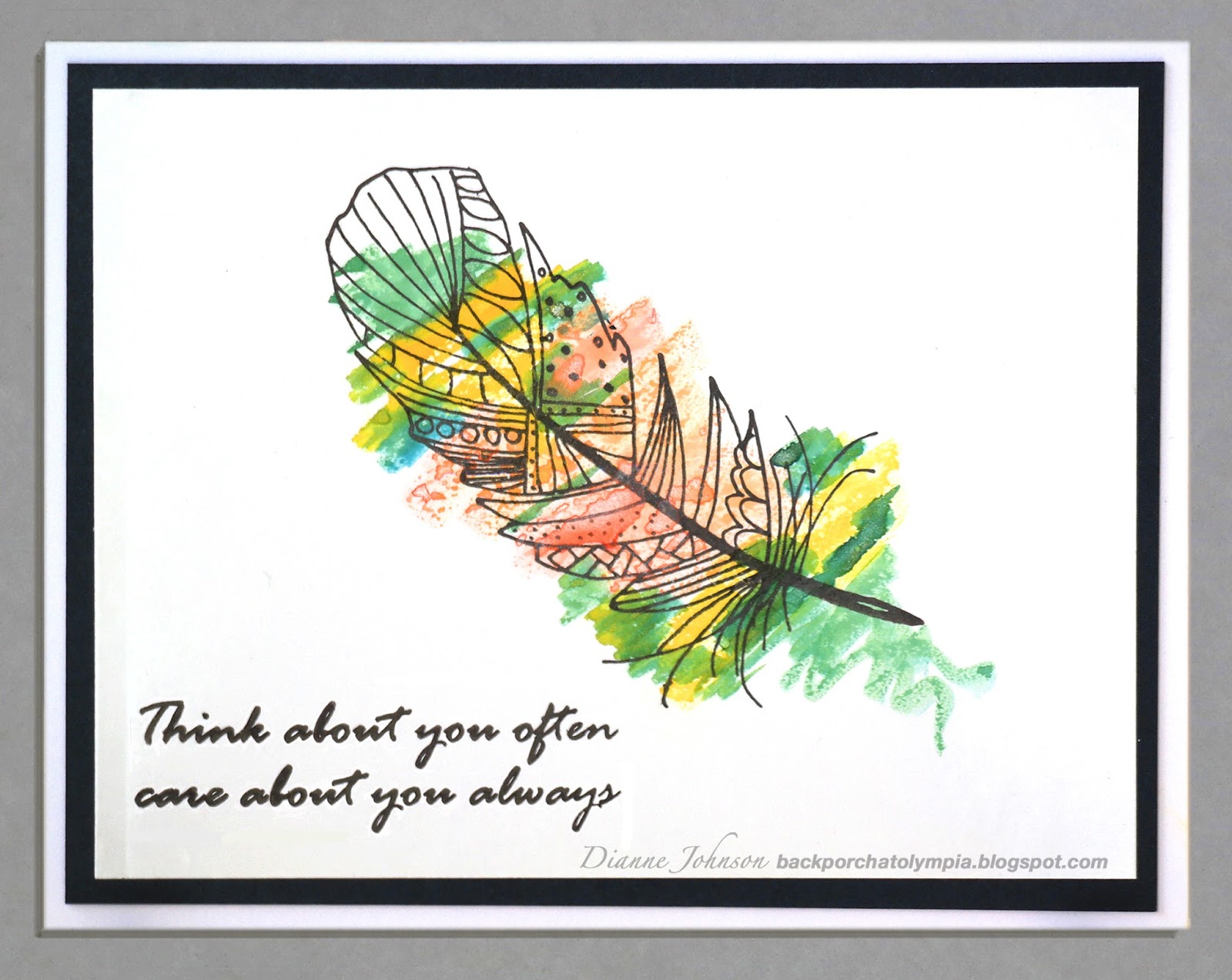
This sentiment "Think about you often, care about you always" and the Doodle Feather are two of my favorite stamps from the new Magenta Summer 2016 release, and they go together effortlessly.


This is a clean and simple design on glossy cardstock. The color was added with Nuance mixed with Perfect Pearls powder. I used a watercolor brush dipped in the Nuance and pearly water. In real life it has an almost metallic effect on the glossy paper. The sentiment (which I think is so lovely for so many circumstances) and the feather were stamped with Versafine Onyx black ink.

I also used the MISTI stamping tool, which is invaluable for stamping on a slick surface. No mistakes! We'll be getting more of these in at Art 'n Soul as soon as they are back in stock!

Magenta Products Used:

37.289.K Doodle Feather

07.954.G Think about you often

MNU001 Turquoise

MNU002 Bright Yellow

MNU004 Jade

MNU008 Golden Yellow

MNU009 Grass Green

Other Products Used:
Versafine Onyx Black ink
Perfect Pearls powder
Kromecoat glossy cardstock
So Silk Black Style cardstock
MISTI stamping tool

Click here to view the entire Magenta Summer 2016 release. It's one of the best ever!